Death Guard as frosted death knights: a 40k army theme
Disclosure: Nobody paid for or sent anything for this post. There are no affiliate links in this post. How I review
Short version: Death Guard are made to look like they are rotting, and I painted mine as frosted death knights anyway. It works because plague marines are already dead things that keep moving, and cold just stops the rot instead of speeding it up. Below is why it works and a general guide to getting the frosted look.
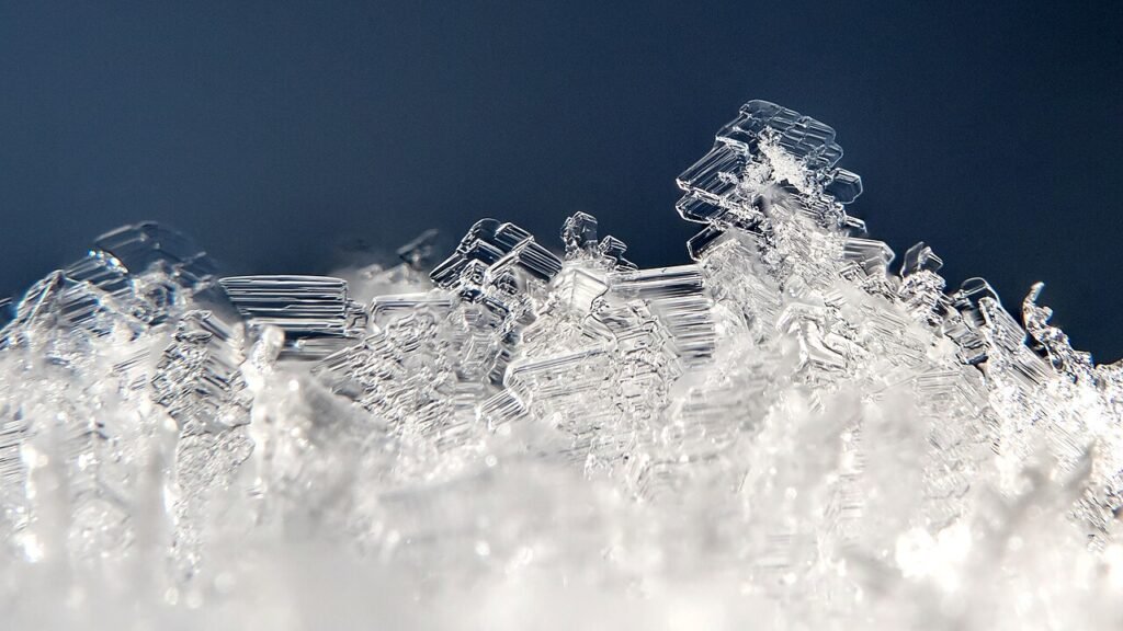
Death Guard are the 40k army that was built to look like it is rotting. Green armor, rust, pus, flies. So painting mine as frosted death knights is a swerve- but it is a good one. The sculpts stay the same. Only the temperature changes.
Why plague marines work as frozen undead
Think about what actually makes Death Guard unsettling. They are dead, or close to it, and they keep walking. The disease is the engine. Cold gives you the same story with a different mood. Some will say frost has no place in an army built around rot. Fair, but the sculpts do not care what the weather is.
Freeze a corpse and decay stops. The armor stays cracked and corroded, the flesh stays slack, and nothing ever finishes rotting. That is a nice fit for a legion that is supposed to be unkillable because of its infections. Instead of damp, bubbling rot, you get something preserved and patient. Plague, but in a blizzard. Still gross…just better preserved.
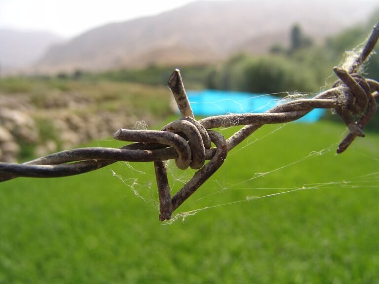
The Death Guard kit helps. The pitted plates, bloated shapes, cables, hoods and rusted trim all read as old battlefield wreckage. Frost looks great collecting on that stuff. The surface texture is already doing half the work.
It also fits the “death knight” part. Heavy armor, a grim silhouette, a faded cold glow on the eyes if you want one. Death Guard are slow and armored already, so a knight who has been standing in the snow for a thousand years is not a stretch. Very Lich King energy.
Practically, it is also a way to stand out. Death Guard are usually painted green. A pale blue and grey army is easy to spot across the table.
How to get this look
To be clear, this section is general advice drawn from published tutorials, not a log of what I did. Here are the building blocks that frost guides tend to share.
For what it’s worth, my own paint shelf is mostly Army Painter, with Games Workshop for technical paints and certain bright hues. And I lean on drybrushing and slapchop more than anything fancy- which suits frost, since a pale drybrush on raised edges is half the look.
- Start from a cool grey. CY Paint recommends a medium grey base for frost rather than black, and warns white primer can look washed out. Another common route is to work from grey into blue, as in this Spikey Bits tutorial on icy horns, which fades a blue into a grey and finishes with a pale highlight.
- Keep the darkest blue in the recesses. Cool shading in the crevices and lighter tones on raised edges gives the sense of cold light. Thin blue glazes in shadowed areas are the usual tool.
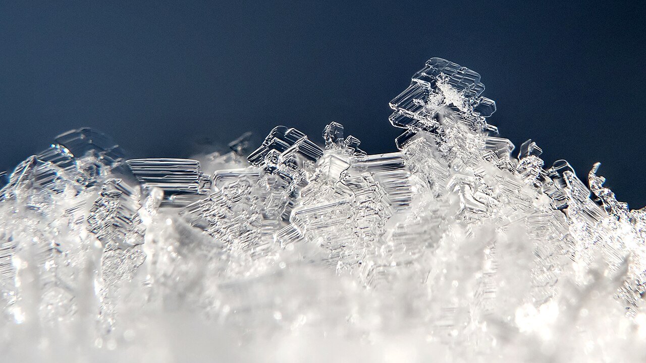
- Drybrush edges with white or very pale blue. A dry brush can give a powdery, feathery frost texture on raised details, and a fine brush with thinned white handles chips and edges.
- Add physical texture, sparingly. The CY Paint guide suggests texture paste or heavy-body acrylic applied with a toothpick or stiff brush in thin layers, with white for heavy buildup and a slight blue tint for deeper ice. Texture paints sold for wargaming bases are another option.
- Keep some grime. The Warhammer Community Death Guard starter article encourages heavy weathering (“dirty them up as much as possible”) and suggests experimenting with pale schemes, so a cold version fits right in. Rust and mud under the frost sells the idea that the armor has been through something.
- Seal it. Matte or satin varnish is the common finish, which keeps the frost from looking glossy.
Test any glaze or texture on a spare model or a bit of sprue first- the same guide notes that overdoing glazes dulls the effect.
Wrap-up
If you already have Death Guard and the green is not doing it for you, a frost scheme keeps the sculpts and the grimness- it just swaps the mood. Decay on pause is a good look. Nothing here is a recipe, so treat it as a starting list and adjust it to the paints you already own.